 WPspice
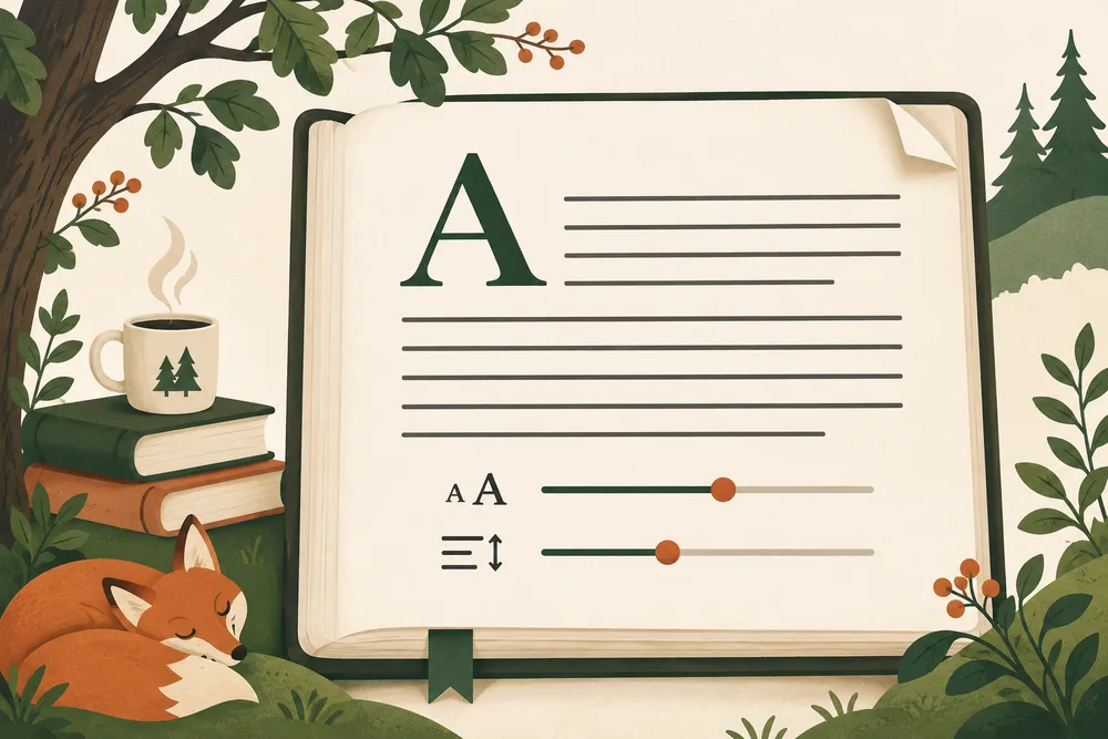
You open an article because the title sounds useful. Three paragraphs later, you are squinting at the screen, losing your place, or wondering why everything feels crowded.
The words may be fine. The page needs a little work.
Before changing the entire design, look at three things: the length of each line, the size of the text, and the space around it. They work together.
Start with a paragraph.
A heading tells you whether a font has personality. A paragraph tells you whether you want to spend time with it. Test several paragraphs, including a link, a bold phrase, and a list. Use real copy. A short sample can hide problems that show up in a longer read.
Try the reading lab.
A little room to read
Good ideas deserve a little breathing room. A comfortable line length helps your eyes find the next line. Space between paragraphs gives each thought a place to land.

Move a slider. Feel the difference.
Move the text-size slider first. Then adjust the line spacing. Notice how the same words feel different when the lines have more room.
There is no perfect setting for every font or every reader. Start with a comfortable size, then check how it behaves on a phone and a wider display.
Keep the line within reach.
A long line makes the eye travel farther before returning to the next one. A very short line breaks a sentence into too many pieces. Give your article a maximum width, then let the outer margins grow on larger screens.
The screen can get wider. The paragraph does not have to.
On a phone, keep enough padding for the words to sit comfortably inside the screen. Check longer words, links, lists, and captions. They should fit without making the whole page scroll sideways.
Make room between thoughts.
Line spacing helps within a paragraph. Space between paragraphs helps between ideas. Headings need a stronger break so a reader can see where the next section begins.
Try stepping back from the screen. Can you still see the shape of the article? If every block looks equally dense, add a clearer rhythm.
A quick check before you publish
Read a full paragraph on your phone. Increase your browser zoom. Follow a link using the keyboard. Check a long heading. Turn off motion. Then ask whether any decoration is getting between the reader and the words.
Keep the playful parts useful.
A slider can explain a design choice better than another paragraph. A small animation can show that a control responded. A heart reaction gives readers a small, friendly way to respond.
Give those details a purpose. Keep the article readable without them, and put the controls where people can find them.
Start with one paragraph. Give it room. The rest of the page gets easier from there.
Leave a Reply